Eurosport and TNT Sports Design System
Client: Warner Bros. Discovery
Project: Multi-brand Design System for Eurosport, TNT Sports and Olympics coverage
Role: Design System Lead. Design system documentation, design tokens structure and creation, Figma component creation, Figma library organisation and maintenance, UI design
Eurosport is the number one sport destination in Europe, unlocking the power of sport through localised content from the world’s greatest sporting events. Eurosport.com is Europe’s No.1 online sports news website with an average of 37 million unique users per month.
TNTSports.co.uk brings fans the latest news, views, live updates and expert analysis as well as free-to-view video clips from the sports TNT Sports presents live.
Both serve as entry points to premium sports coverage via WBD streaming and broadcast channels.
Challenges
Long lead times on delivering multi-brand features
Inconsistently built components
Limited design decisions made into components
Design knowledge in individuals’ heads
Strained relationships with development teams
Inconsistent handover processes
Little knowledge in the wider team about what a design system is and how to implement one
Solutions
Engagement with the wider team to help inform a design system “Playbook”. This was to bring everyone along on the journey, get buy-in from stakeholders and boost knowledge levels across the team. This included proof of concept demonstrations to show the power of tokens in a design system and mini workshops to determine requirements from development teams and the Product team
Regular syncs with development teams to make sure progress on the design side matched their expectations for delivery. Communication was key
Documentation templates created for component design showing the component set across breakpoints, with all variants across brands including edge cases (e.g. line limits on text elements) and any dependencies on other components
“How to build a component” checklist – to ensure any designer creating a component uses auto layout and component properties in consistent ways, to make the component efficient on memory, intuitive variants and options, and created with development in mind
A new component library to house the newly created components and their documentation
A system of design tokens to control colour, type, and sizing for Eurosport, TNT Sports and Olympics brands. A huge undertaking, but necessary to give the right level of control and to speed up delivery of features and reduce design and development time
Worked closely with developers adjusting the tokens structure to help them create a bespoke token extraction tool, as available plugins didn’t serve the purposes of our iOS, Android and Web teams. The result was TokenFlow which automatically collects the tokens from Figma every night, checks for issues, hands them off to each platform, where they are formatted for Web (Tailwind), iOS (Swift) and Android (Kotlin)
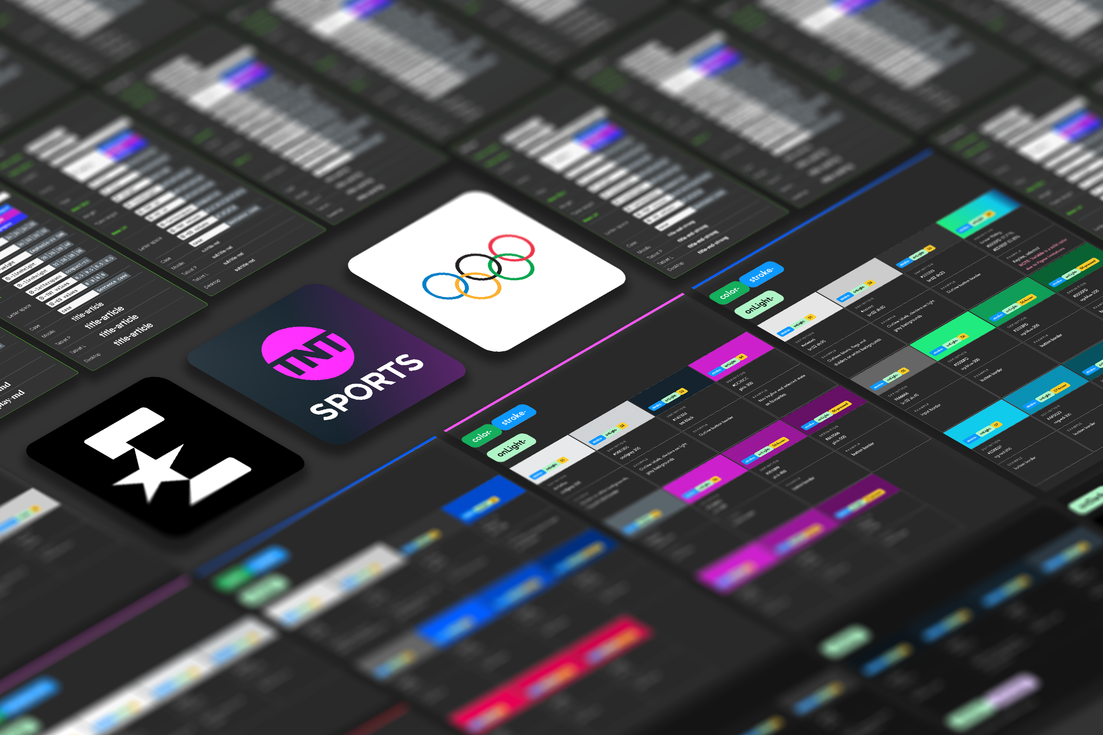
Token Collections
A token structure for two permanent brands and one additional, time-limited brand that work across four breakpoints, with the ability to theme individual sport-specific components as well as have the future capability to give users light and dark mode without additional coding, was an enormous task to define. Below shows some of the structure that was implemented.
Design token structure
With a requirement to support multiple brands, the token structure needed the ability to control each design decision across brands and breakpoints.
To give us the control over all these decisions, without getting overwhelmed, a Figma variables structure was created with 5 collections.
Base: raw values with basic naming for all types of token (primitive tokens)
Brand: where decisions are made for each brand and given some meaning for colour, type and sizing (semantic tokens)
Device: where decisions are made for each breakpoint and given some meaning for type and sizing (semantic tokens)
Mode: where decisions are made for specific component colours as well as for Light and Dark Mode (component tokens)
Theme: where sport-specific colours can be specified for components or pages
Anatomy of a colour token
To help increase the wider team’s knowledge of design tokens and to map out for the other designers the approach to creating tokens, these anatomy diagrams were created as a reference tool. Colour was a good place to start to show the differences achieved between Eurosport and TNT Sports.

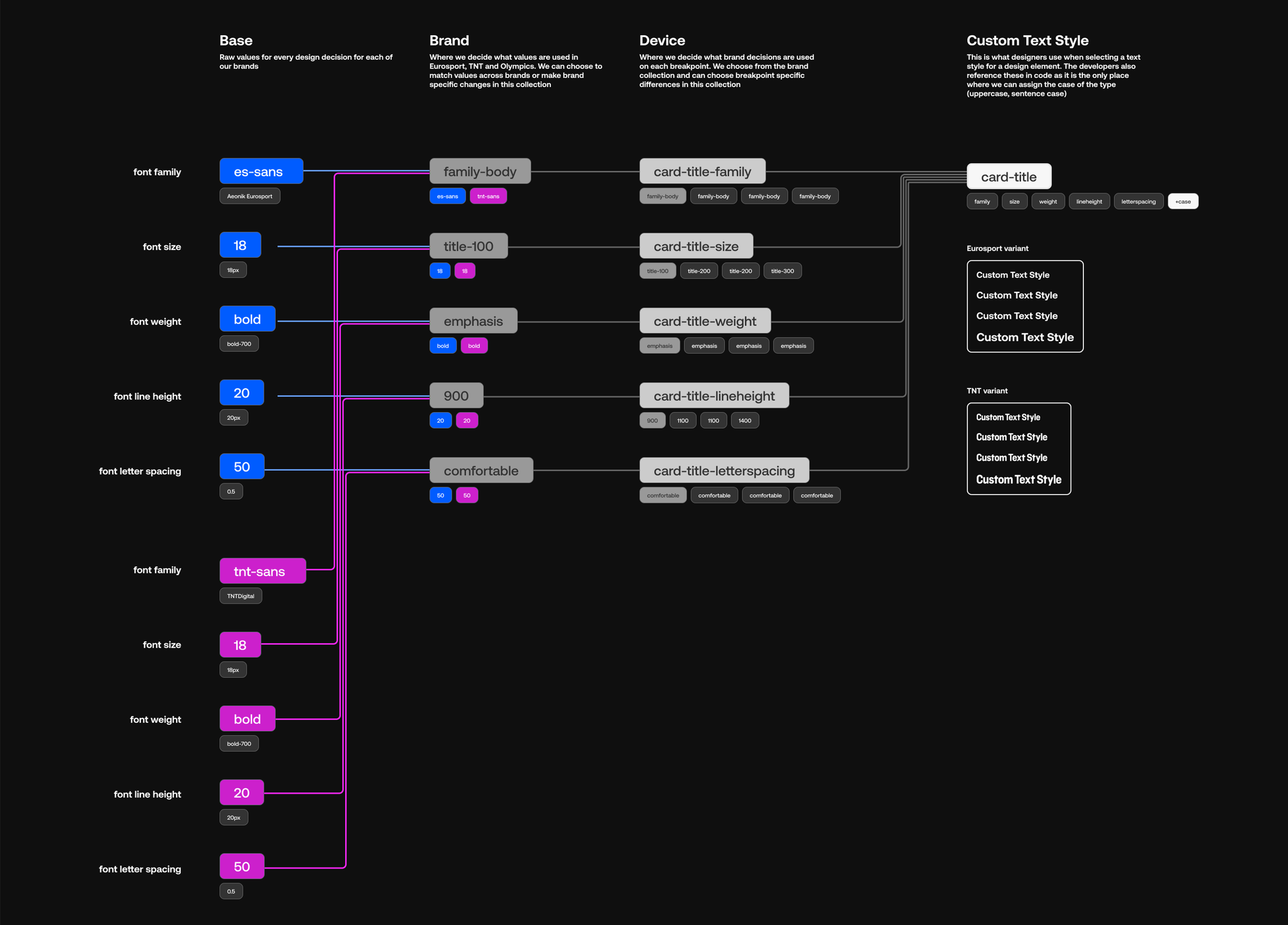
Anatomy of a typography token
Typography tokens are composite tokens – made up of multiple tokens – combining font family, weight, size, lineheight and letterspacing. Figma doesn’t allow you to specify the case of any type within variables, but all type decisions are then referenced in Figma text styles, where you can specify if a style should be uppercase or lowercase.
Anatomy of a spacing token
Spacing tokens form part of a larger Sizing token group which also contains border stroke and border radius decisions. In order to help designers choose the correct spacing tokens, consideration was given to the naming. This meant tokens with “padding” in the name can only be used for top, right, bottom, left padding. Tokens with “between” in the name can only be used for gaps.

Component libraries
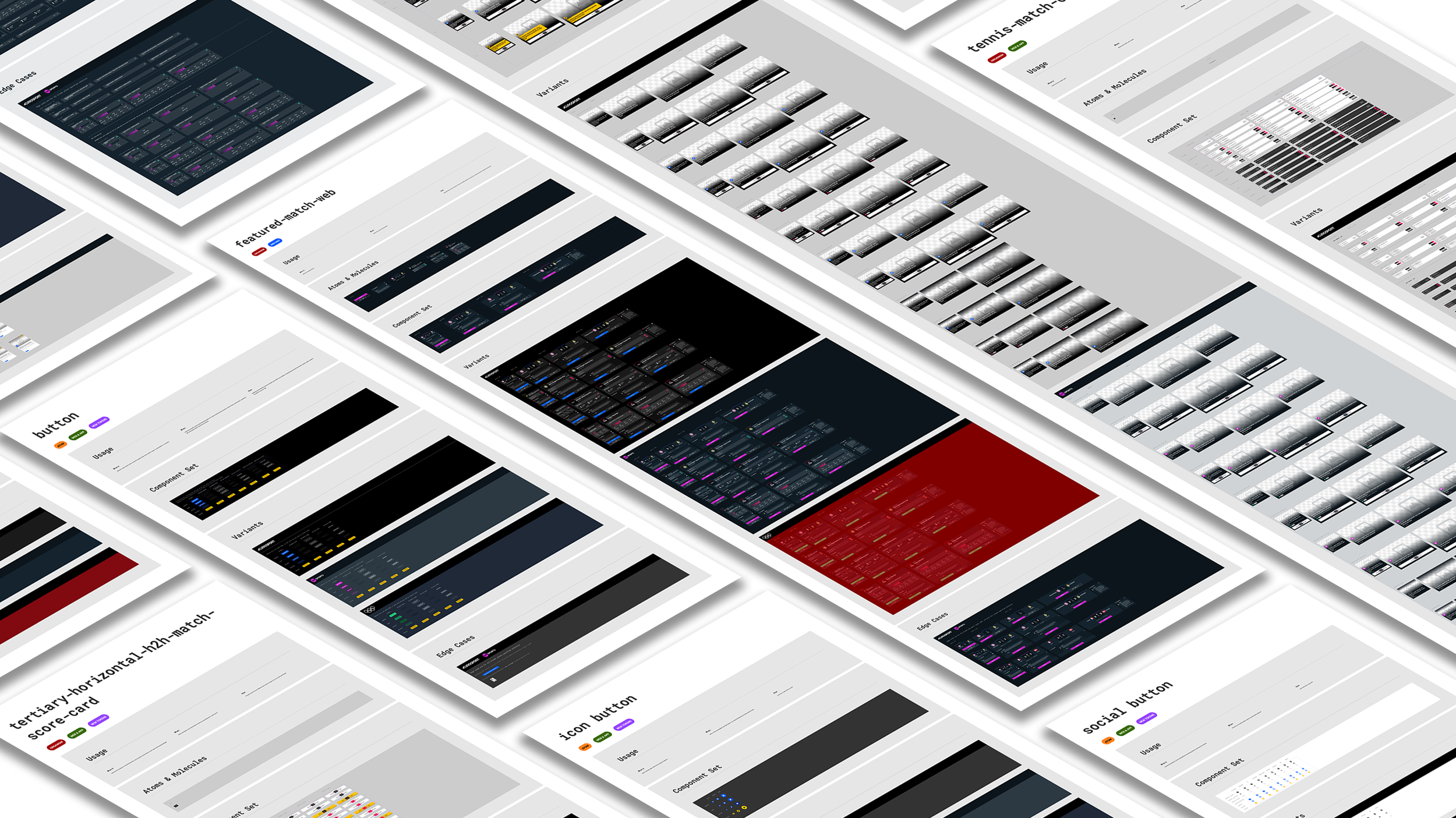
The design team had previously created some components in Figma, having migrated their workflow from Sketch. Without tokenisation, each component had to be a brand-specific one. Now with the token structure advanced enough, components were built from scratch using these multi-brand design tokens. This brought some complexity to the design hand-off as the components now contained the information for each brand within the tokens. It was not easy for developers to see how each brand behaves just by looking at the component set. To bring all the design decisions together in one place, along with all variants, edge cases, prototypes and dependencies, we created Component Sheets. Annotations can be added and there is the ability to show changes made to an existing component, creating an individual change log for a component.
So as not to create confusion, a new component library was created to house all the components using the design tokens. A task for the design team was then to migrate existing and new designs to use instances of these components – an ongoing body of work, coordinated with the Product team’s roadmap and the development teams’ sprint planning.
Conclusion
In approximately 12 months, the impact of creating this design system has been seen with:
the team going from having to make and provide decisions each and every time any design was handed over to development, to using a set of decisions across all designs increasing consistency and maintaining brand visual language
reduced time from start of design to ready to deploy – for the next Olympics, where previously it took 4 months to deliver designs, changes to tokens could provide those same designs in a couple of weeks with brand and stakeholder approvals
a system of tokens consisting of 312 base values, 364 brand decisions, 397 responsive decisions and 343 component decisions giving control to designers and consistency to our products
knowledge accessible to all with documentation and regular syncs
a reduction in published components from around 250 to 100 at present
a team of designers, developers and product owners being much more closely aligned on their goals and roadmap
tokenised component repositories for each platform
Semi-automated workflow for updating designs through manipulating tokens and utilising TokenFlow